The Design Process
1. Research & Discovery
The process began by breaking down the company's core services and values into visual keywords.
Engineering: Sharp lines, geometric grids, structural stability, symmetry.
Adventure: Motion, upward trajectories, tension, high contrast.
Heritage: Heraldry, legacy, the wolf (symbolizing loyalty, strength, and family).
2. Conceptualization & Iteration
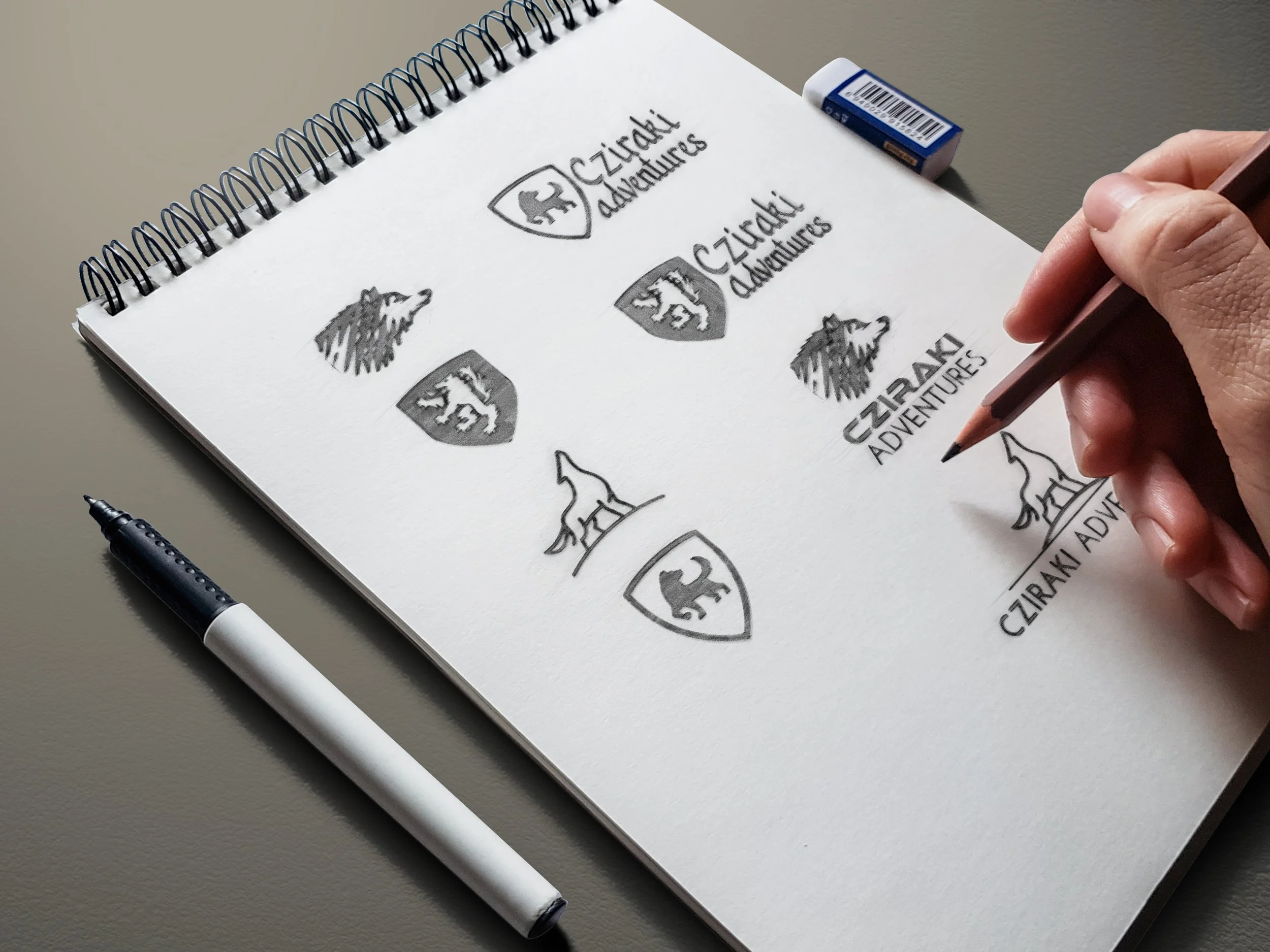
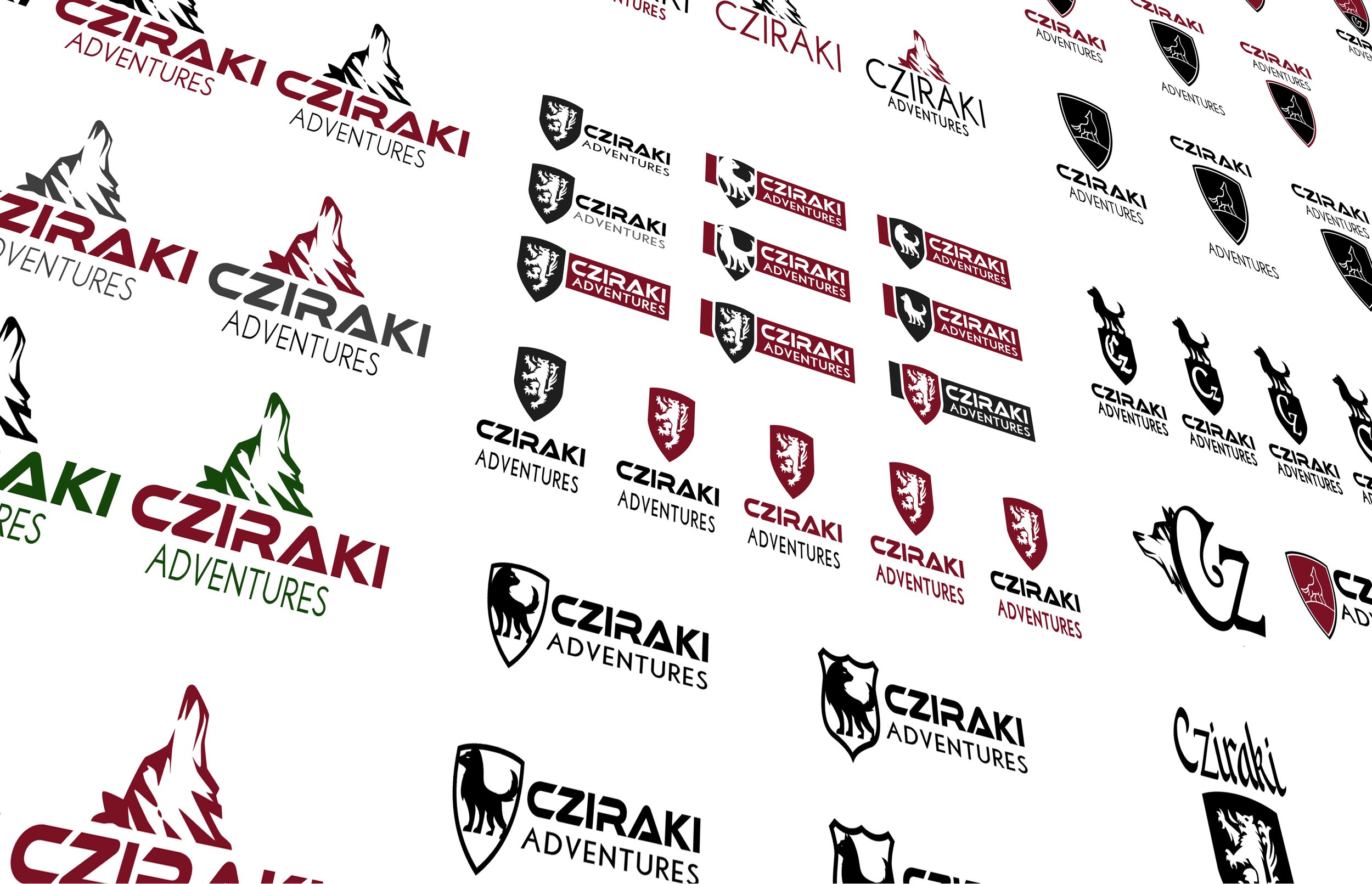
Early exploratory sketching focused on understanding the dynamics between the wolf motif, the coat of arms, the text, and the colours.
The Pivot: Merging Heritage with Modernity
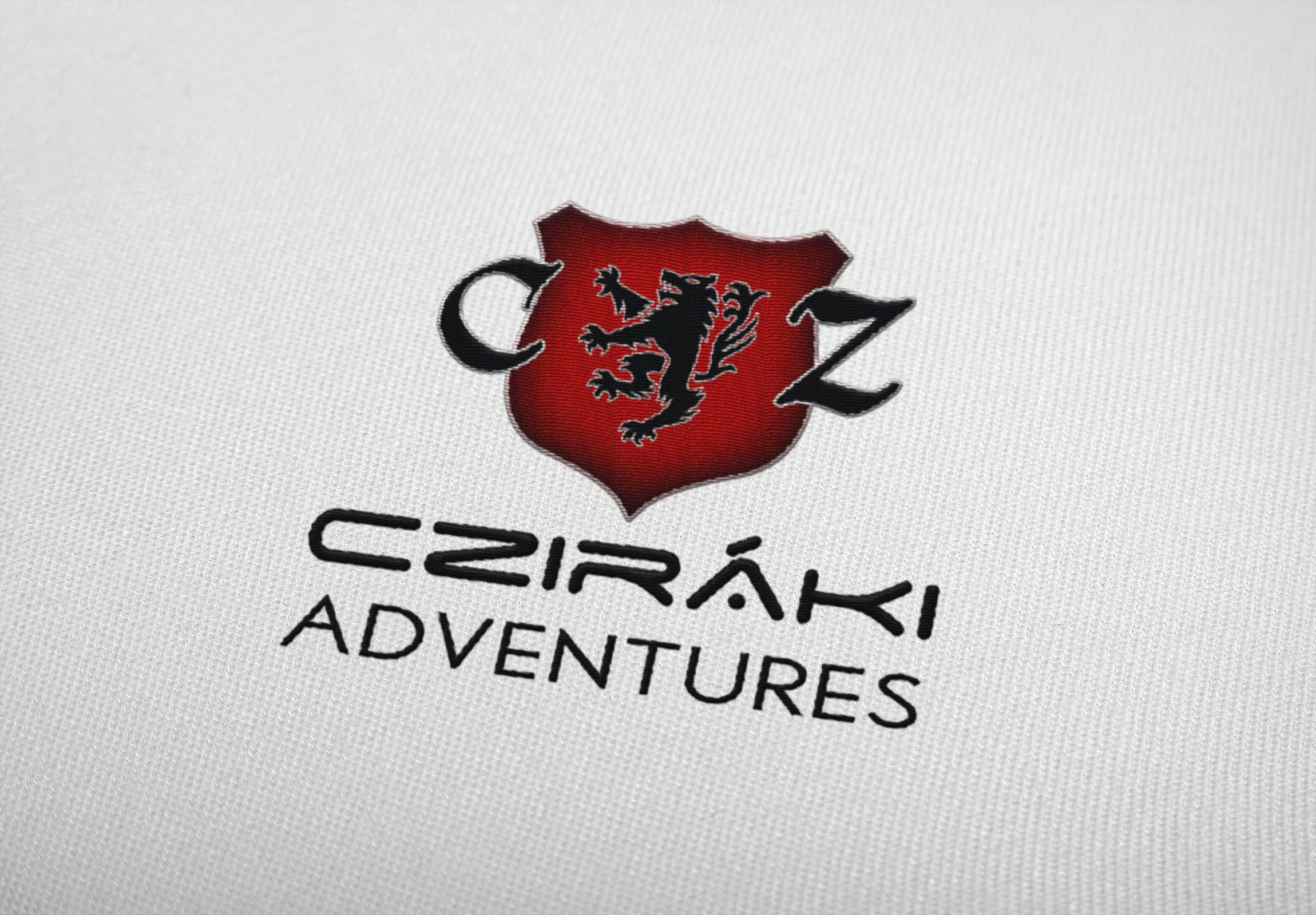
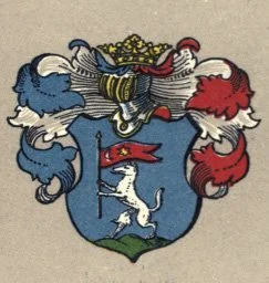
The Catalyst: The discovery of a historic coat of arms introduced a wolf emblem and medieval/Gothic letterforms (C and Z) as shield supporters.
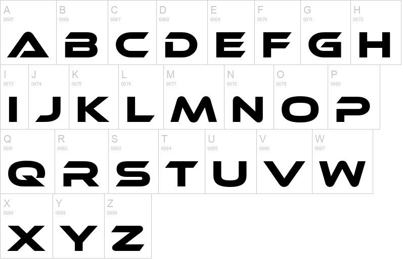
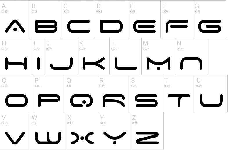
The Challenge: Ethnocentric clashed heavily with the organic, intricate lines of the new heritage graphics, requiring a complete typographic overhaul.
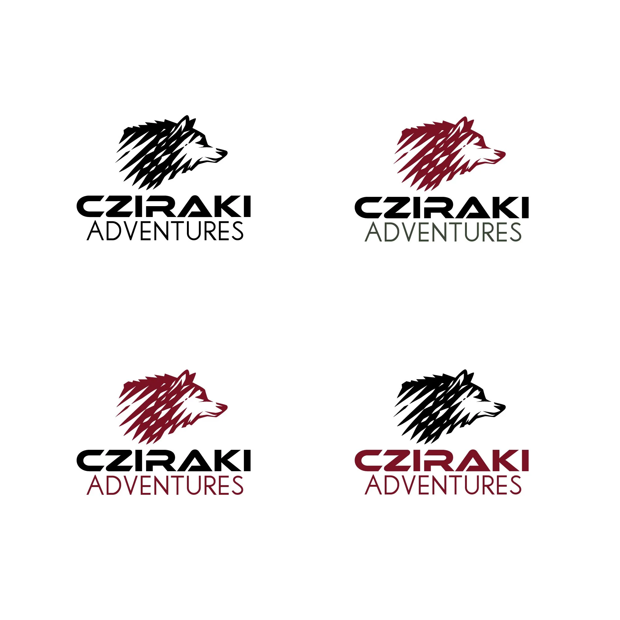
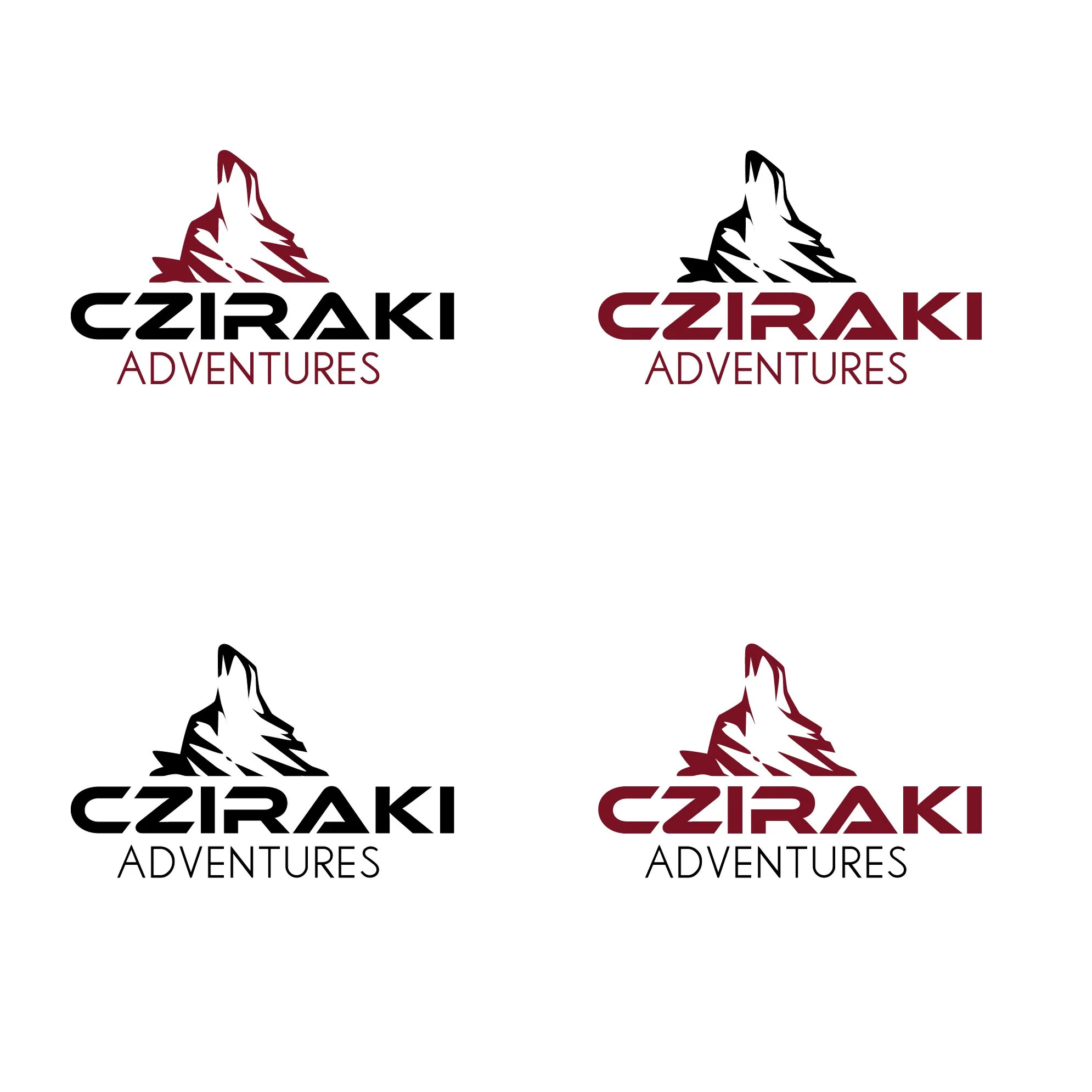
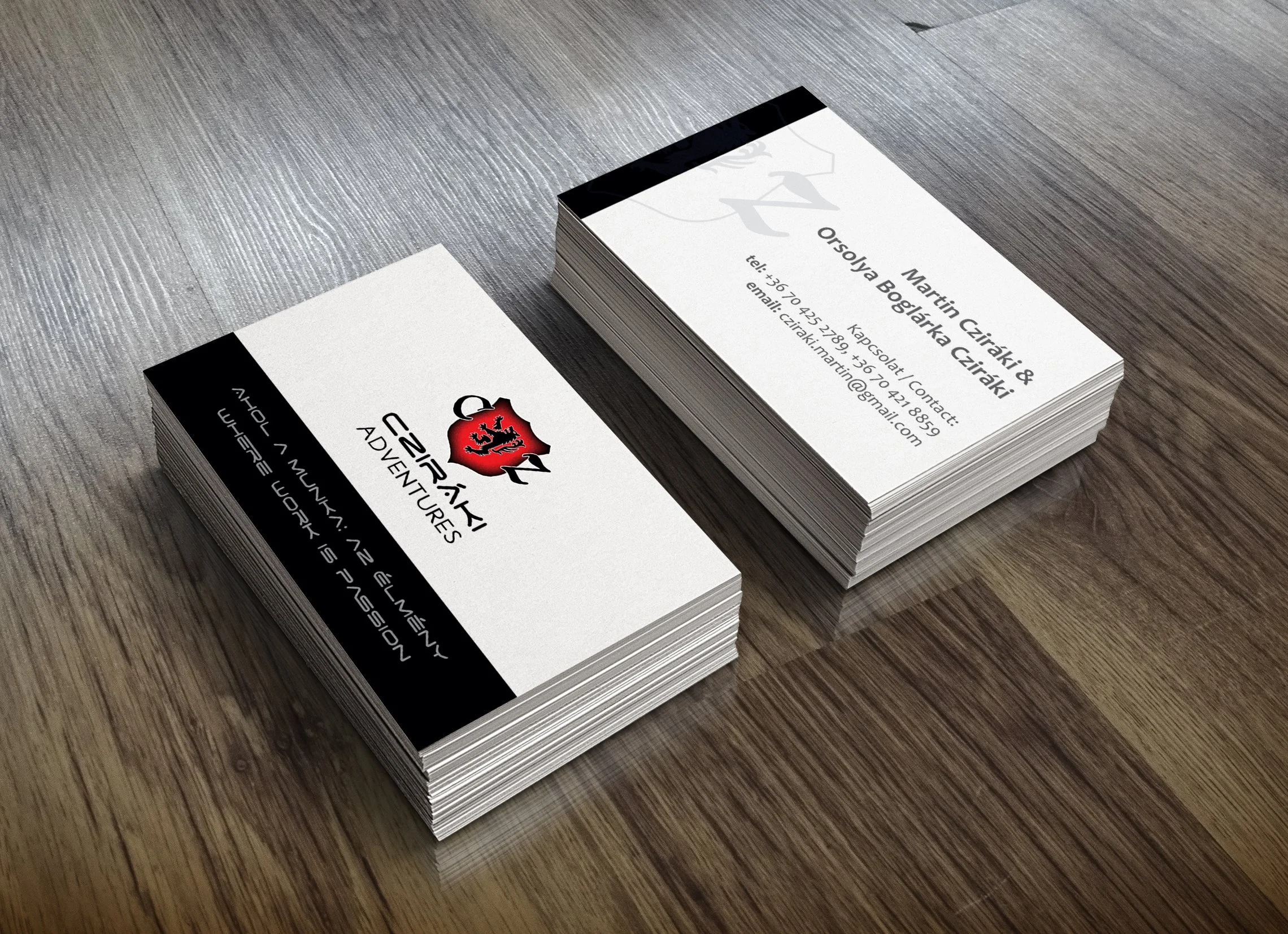
The Solution: To bridge the gap between the medieval past and the modern age, the typography shifted toward a sleek, elegant, and cosmic aesthetic. Space Age was selected as the final typeface, perfectly balancing the historic weight of the coat of arms with a refined, futuristic elegance.
3. Typography Strategy
Primary Typeface: I`ve selected Ethnocentric for the logo to establish a bold, techno-futuristic, and geometric foundation.
Secondary Typeface: a light sans-serif with tall capitals was chosen to provide visual relief and strong contrast against the heavy primary weight, beating out traditional alternatives like Futura and Montserrat.
Constraint: Classical and serif typefaces were strictly avoided to prevent historical structures from clashing with the ultra-modern aesthetic.
Results and Impact
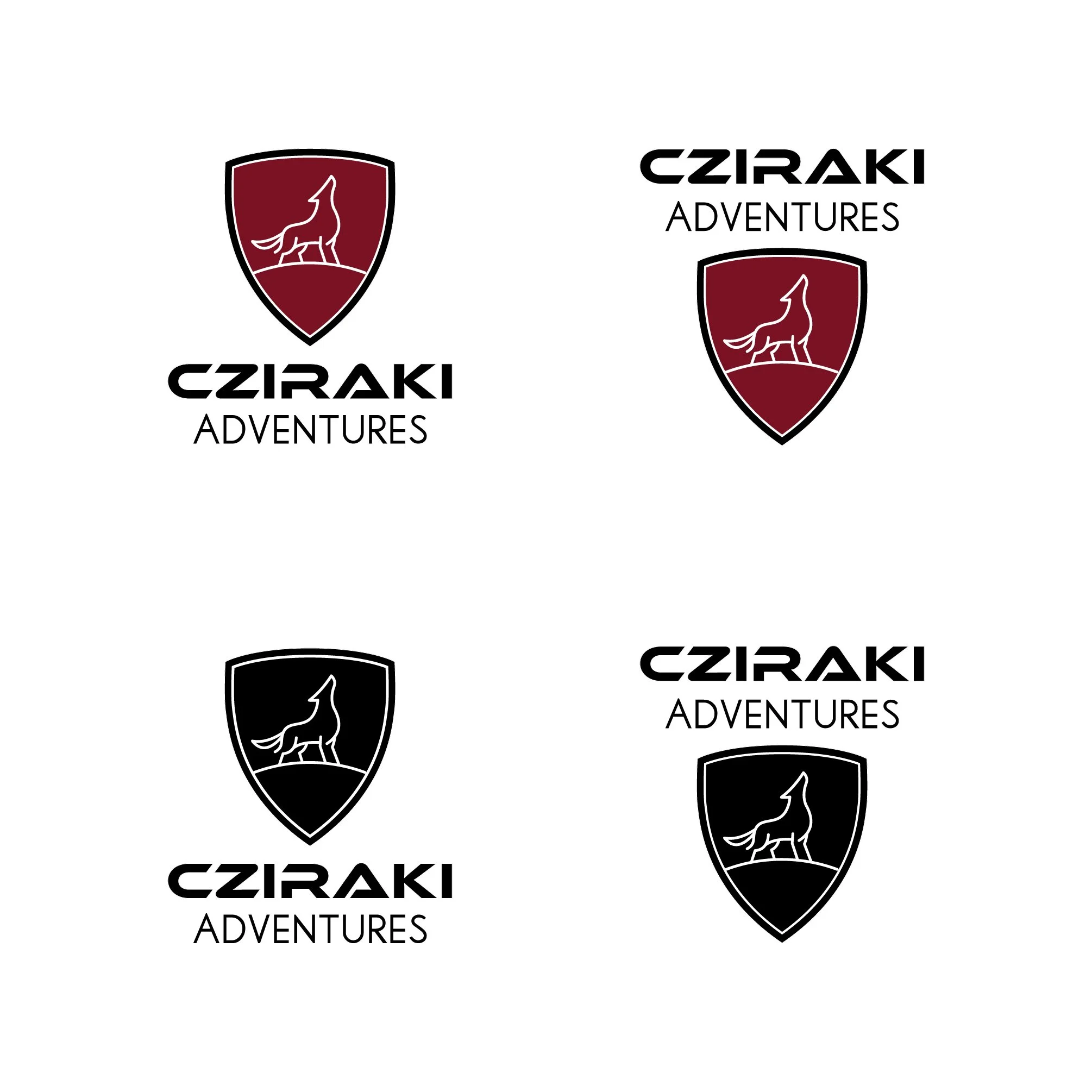
The final visual identity successfully established the startup as a premier, trustworthy player in the European adventure tourism market.
Client Satisfaction: The owner received a deeply meaningful brand mark that honors his family heritage while matching his exact aesthetic criteria.
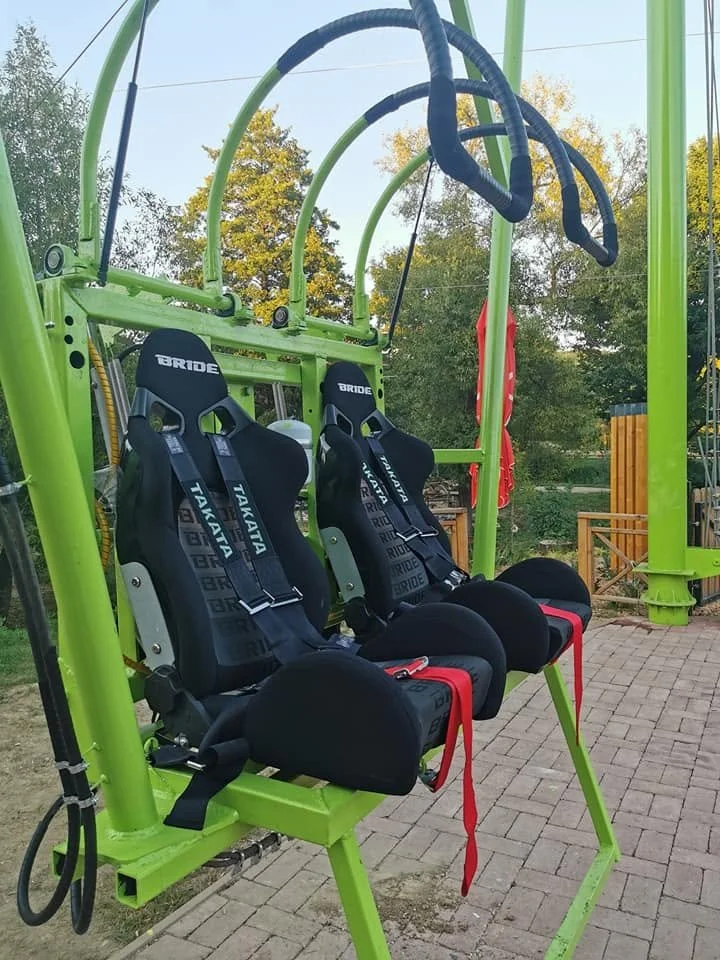
Functional Versatility: Because of the modular design, the logo scales perfectly across all mediums—from massive steel-tower plates and safety harness embroidery to digital engineering schematics and corporate stationery.
Market Positioning: The bold color palette and precise iconography immediately communicate safety, engineering authority, and high-altitude excitement, helping the company secure its first round of commercial park contracts.
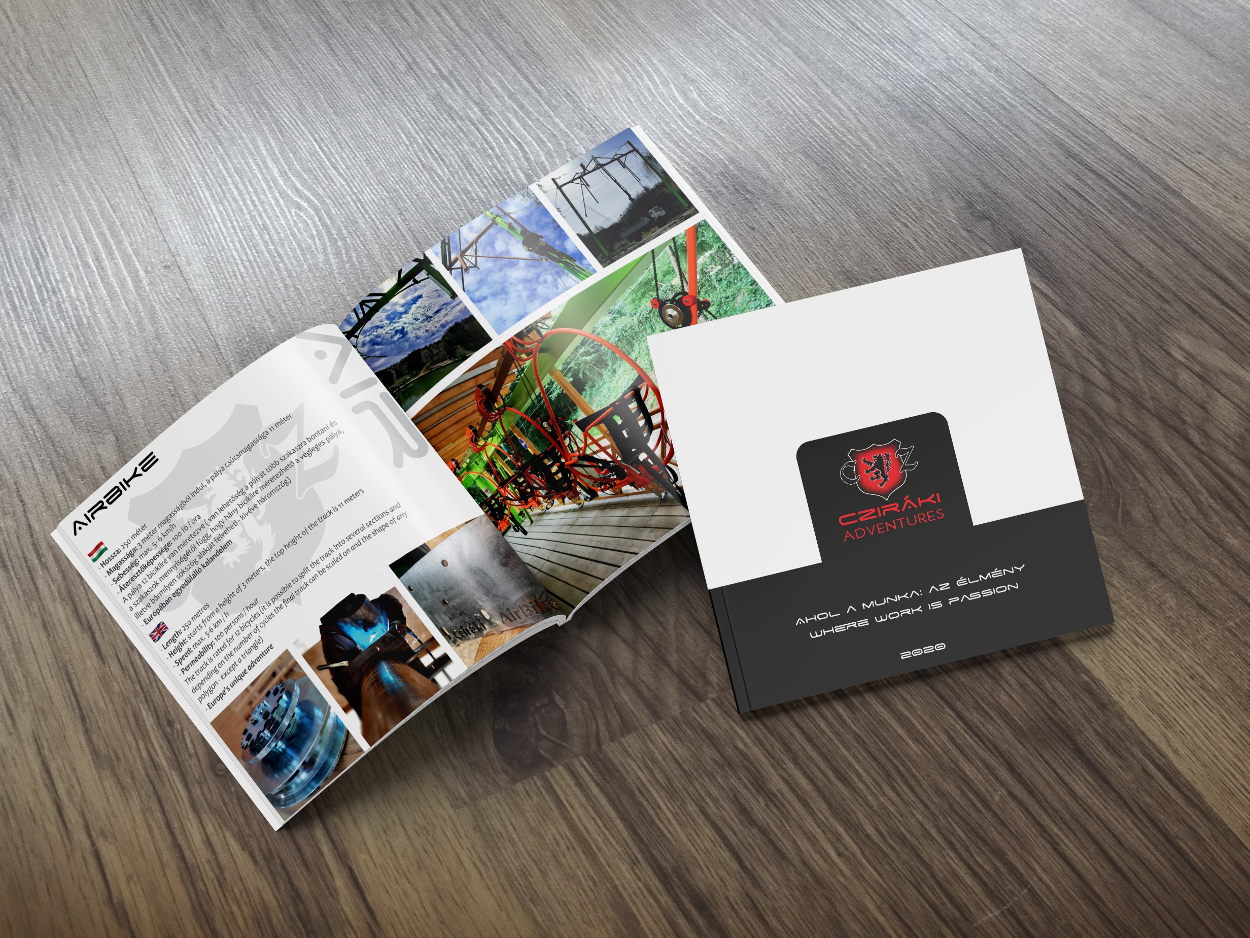
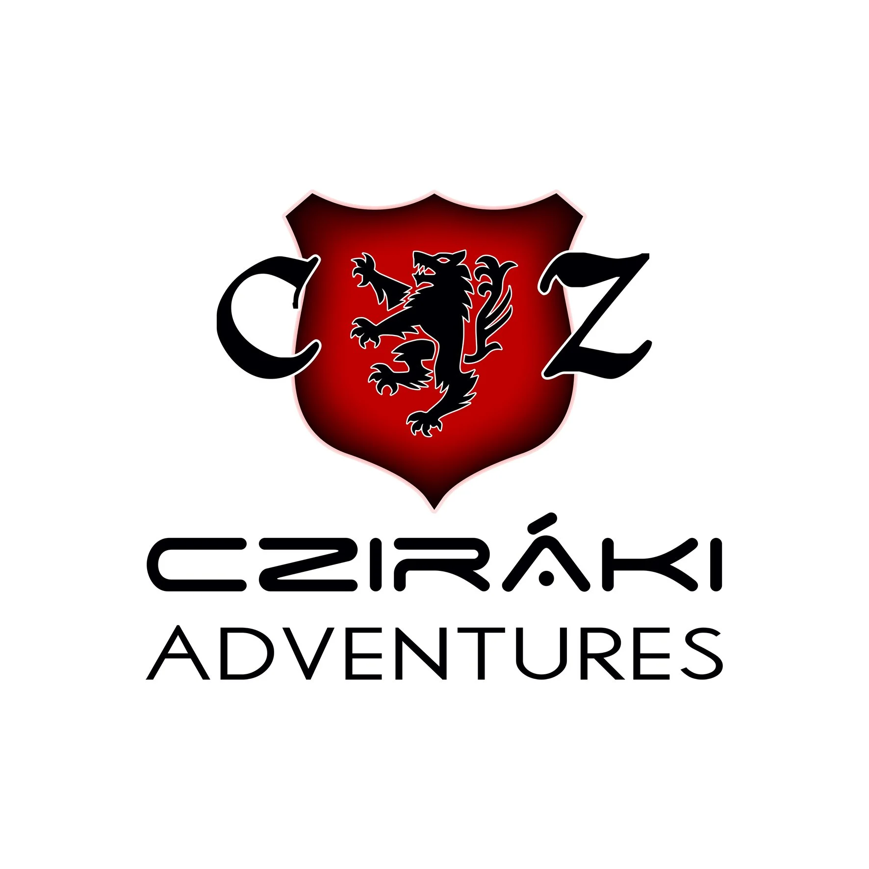
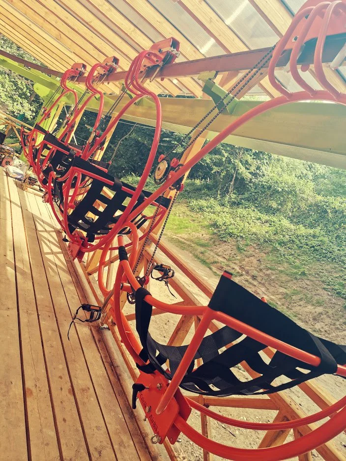
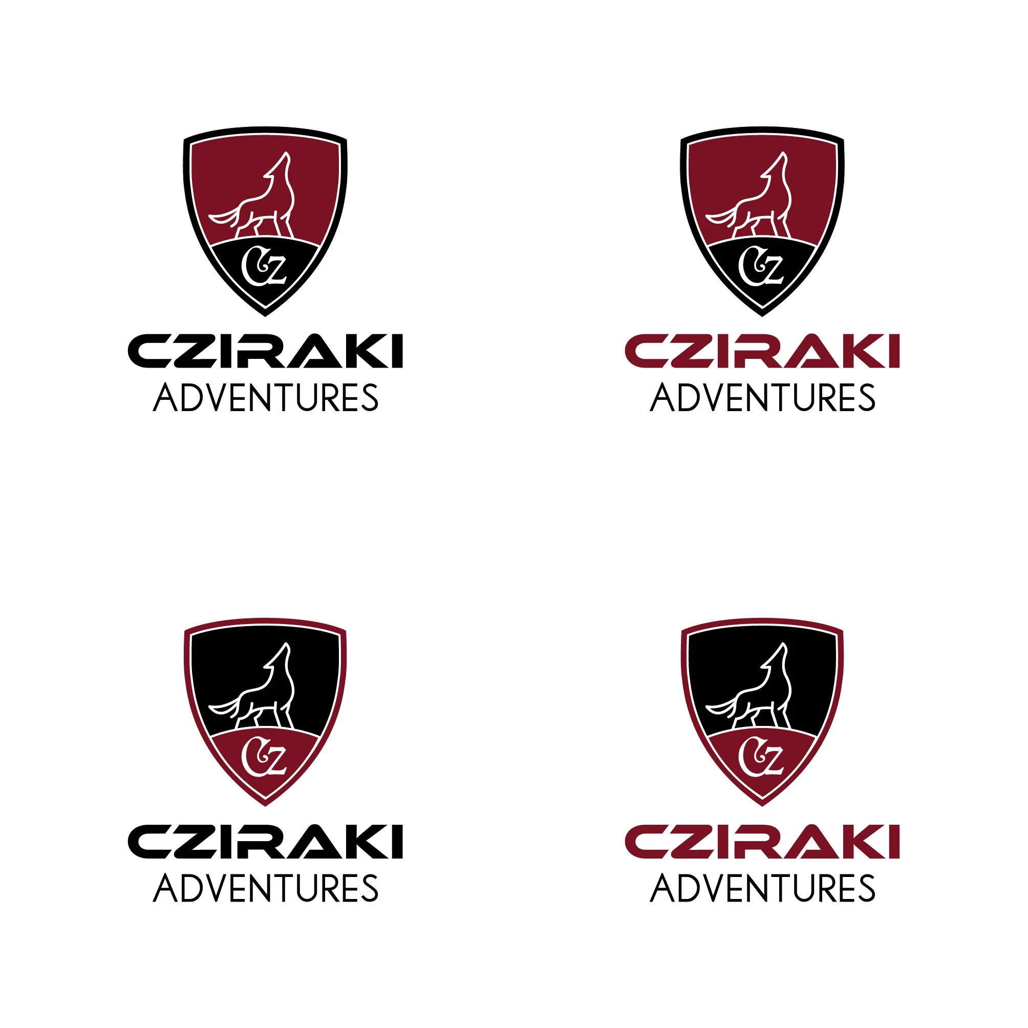
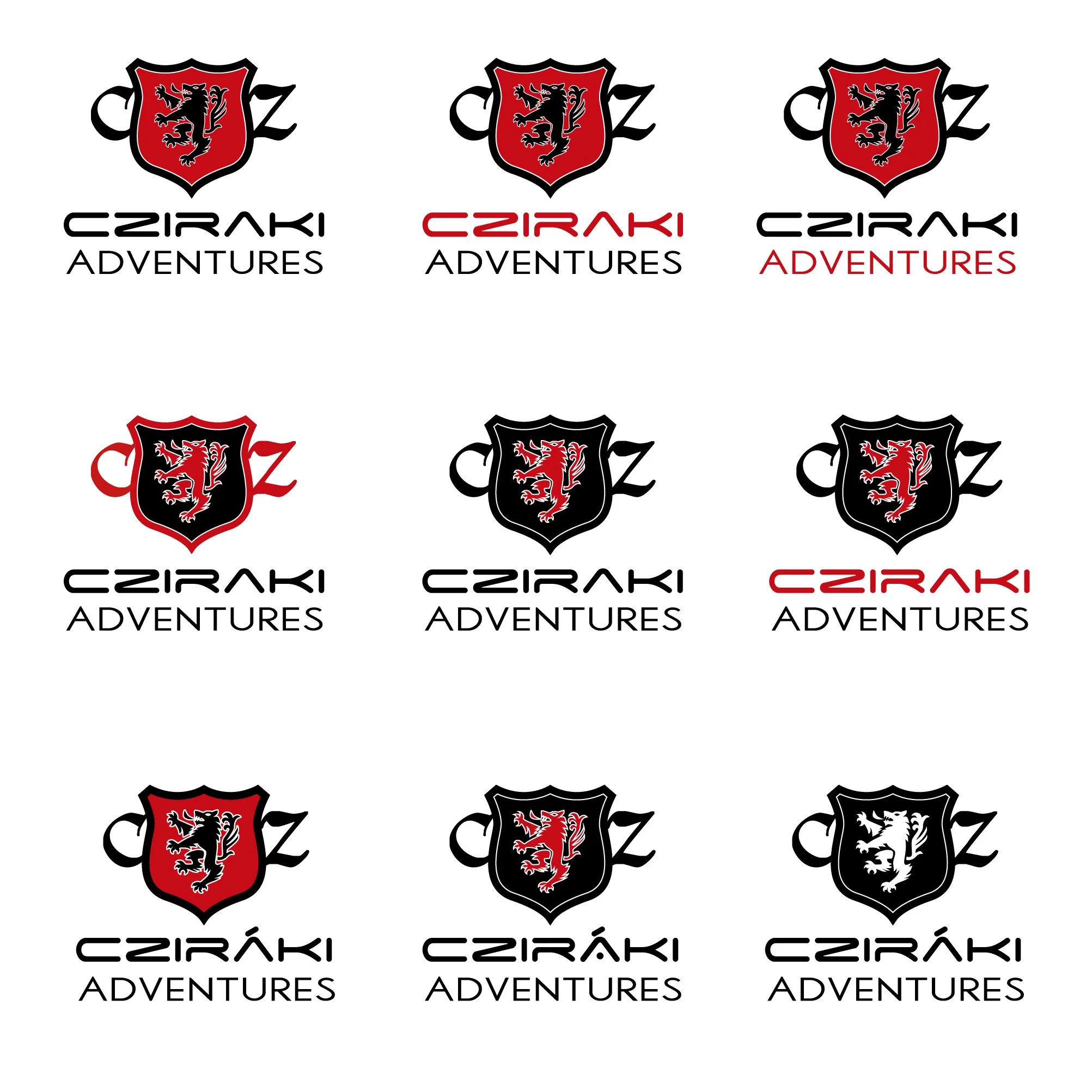
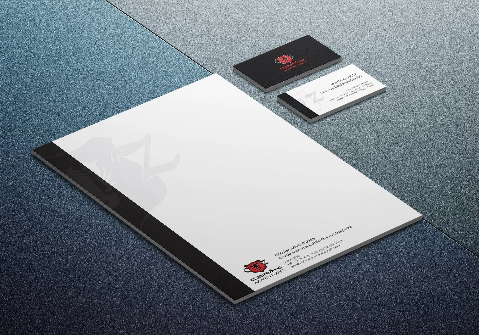
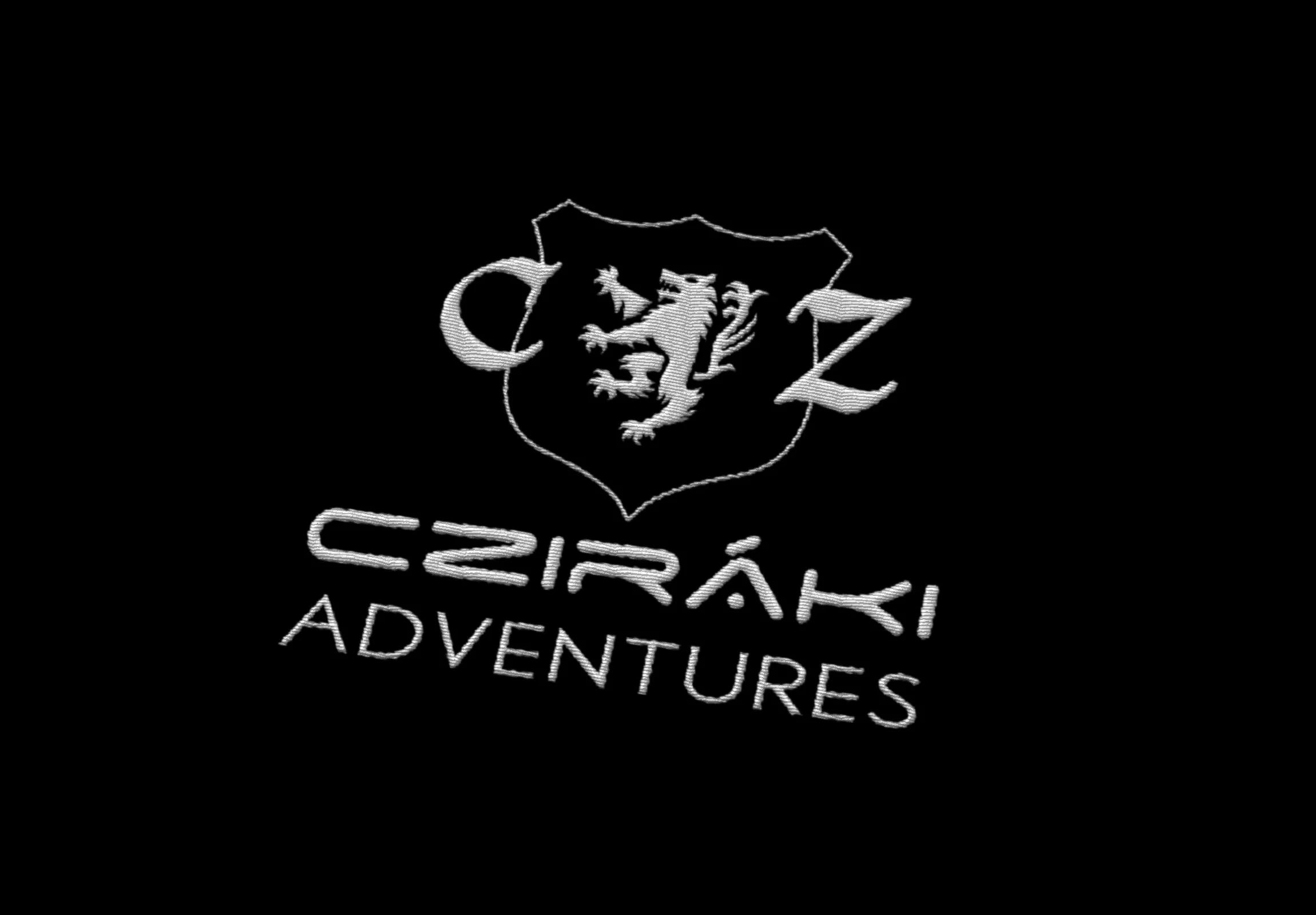
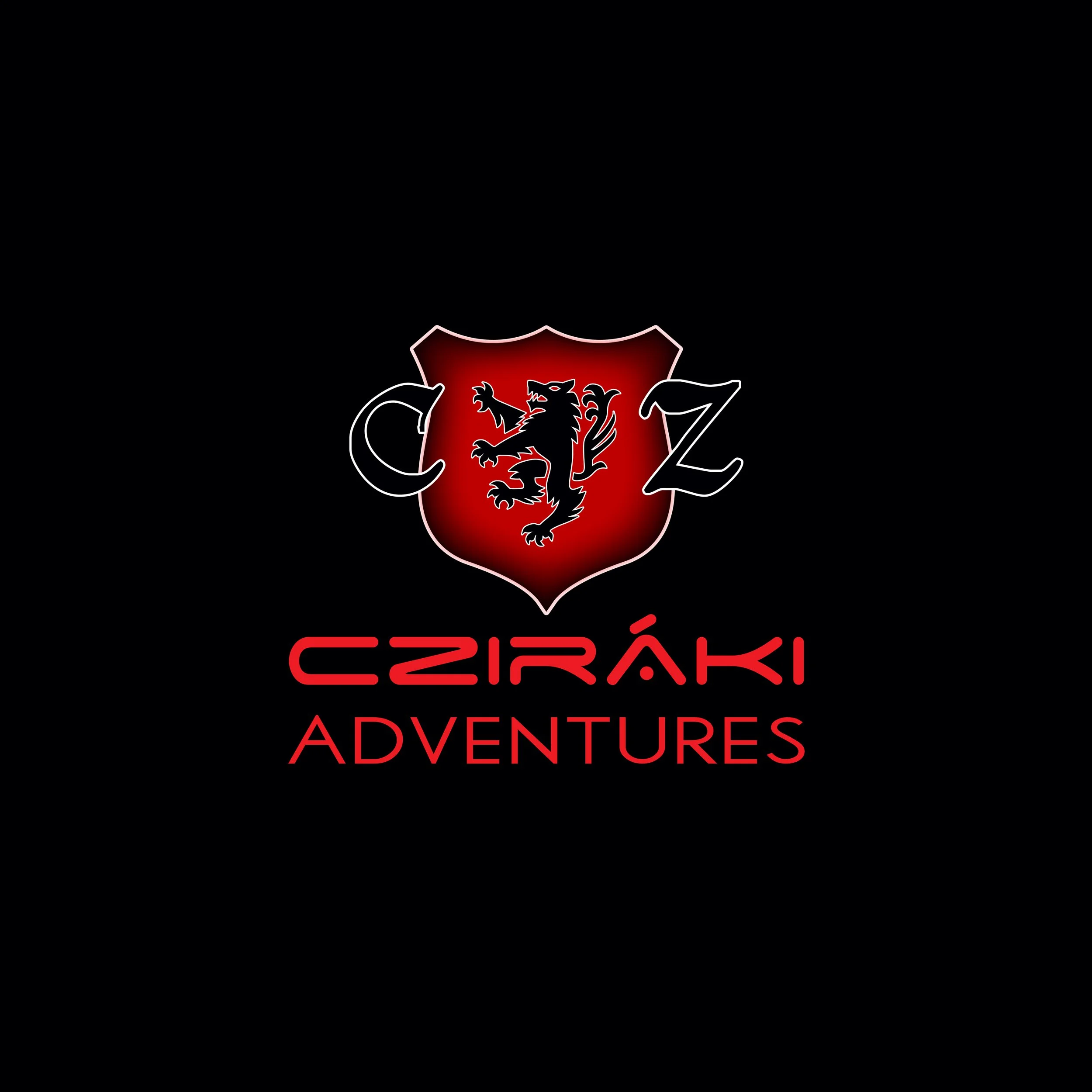
Case Study no. 2.: Logo and brand identity, brochure, business card, and a promo video
Combining Heritage with High-Altitude Adventure
Project Overview
Role: Graphic Designer
Timeline: 4 weeks
Client: Cziraki Adventures (www.czirakiadventures.hu)
Objective: Tocreate a visual identity centered around a flagship logo that bridges ancestral history with cutting-edge engineering.
Core Requirements: Design a sleek, corporate logo for a high-tech construction and adventure firm.
The Challenge / The Problem
The primary challenge was balancing disparate, highly specific brand attributes into a cohesive, functional modern design. The logo needed to convey engineering precision and maximum safety while simultaneously capturing the raw adrenaline of extreme adventure sports.
Furthermore, the client required two deeply personal constraints to be seamlessly integrated:
Incorporating a wolf motif and a traditional family coat of arms.
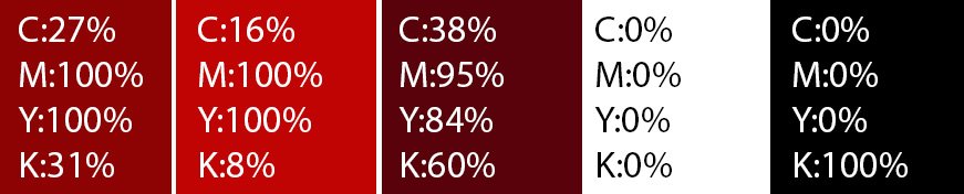
Utilizing a strict, high-contrast color palette of black, red, and white.
The core creative obstacle was preventing the logo from looking like an outdated medieval crest or a generic wildlife badge, instead transforming it into a sleek, corporate identity for a high-tech construction and adventure firm.