The Design Process
1. Color Palette Selection
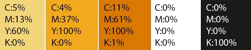
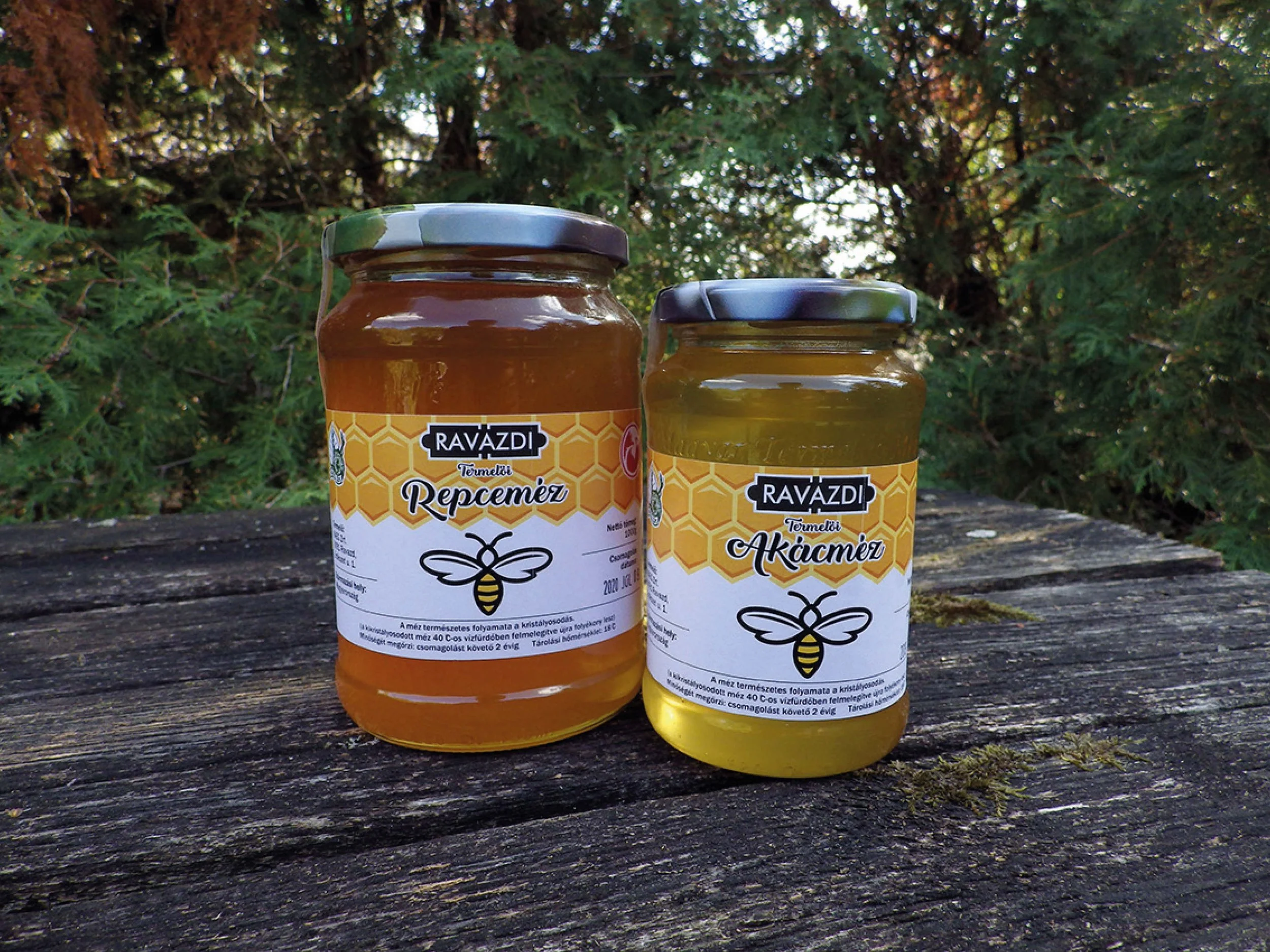
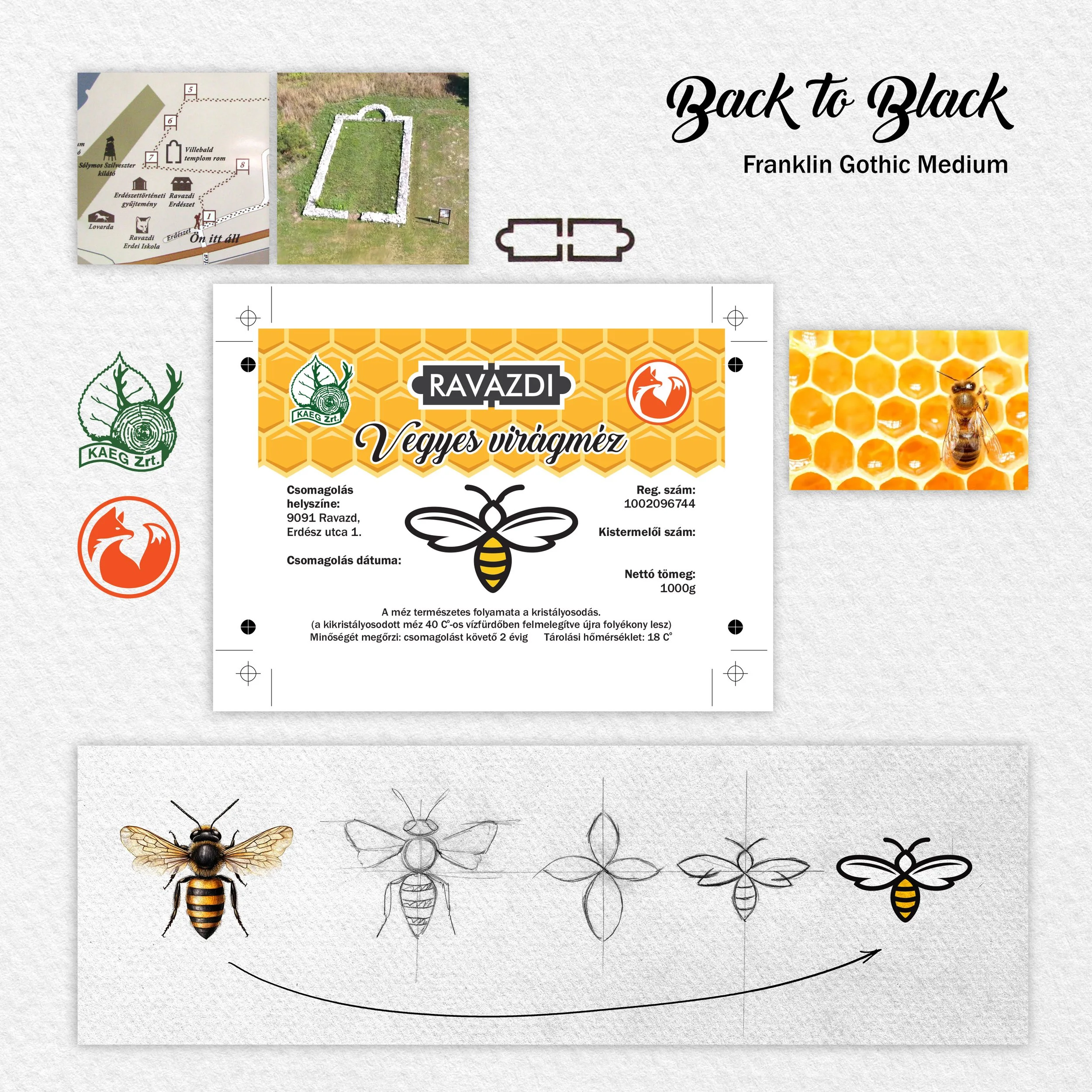
To capture the essence of the product and its origins, the palette directly reflects the natural world of the honey bee:
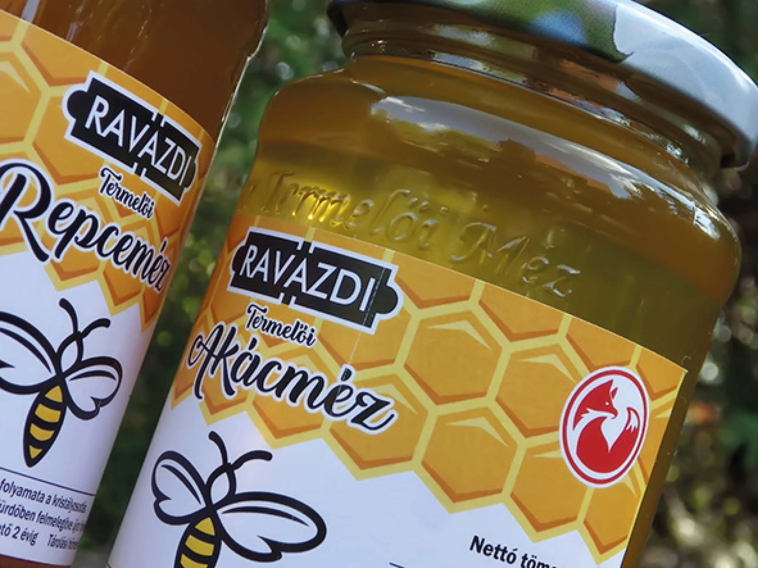
Bright Yellow Base: Serves as the primary background color to ensure high shelf visibility, energetic appeal for all ages, and an immediate connection to honey.
Bee-Inspired Accents: Deep blacks and earth tones complement the yellow base to establish excellent visual contrast.
2. Typography Strategy
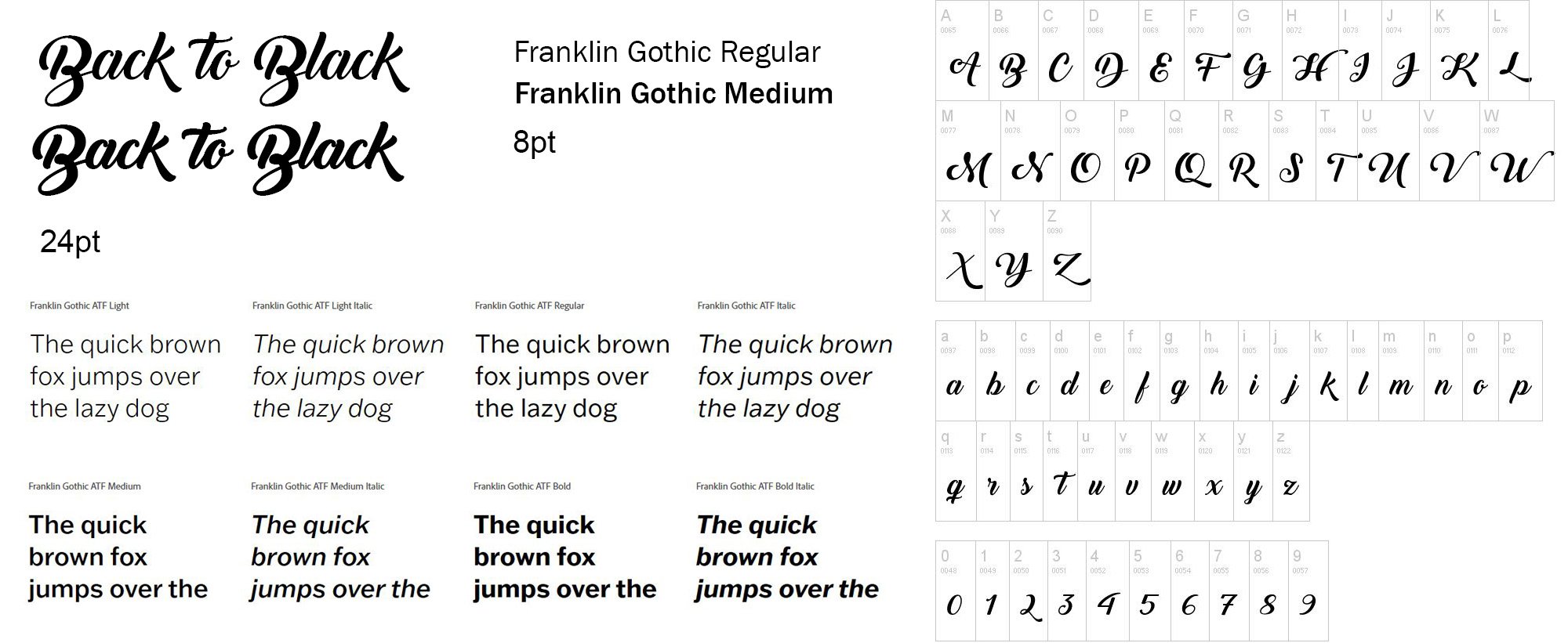
Two highly contrasting typefaces were paired to represent the duality of the brand's professional and artisanal nature:
Back to Black: Decorative / Calligraphic
Casual, sweeping loops that mimic natural handwriting. It reinforces organic origins, feeling energetic, personal, and artistic.
Franklin Gothic: Grotesque Sans-Serif
Sturdy, clean, and geometric. It provides a strong, functional presence that grounds the design with professional stability.
3. Visual Storytelling
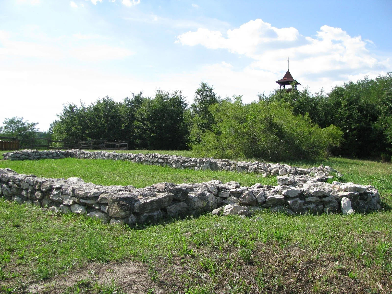
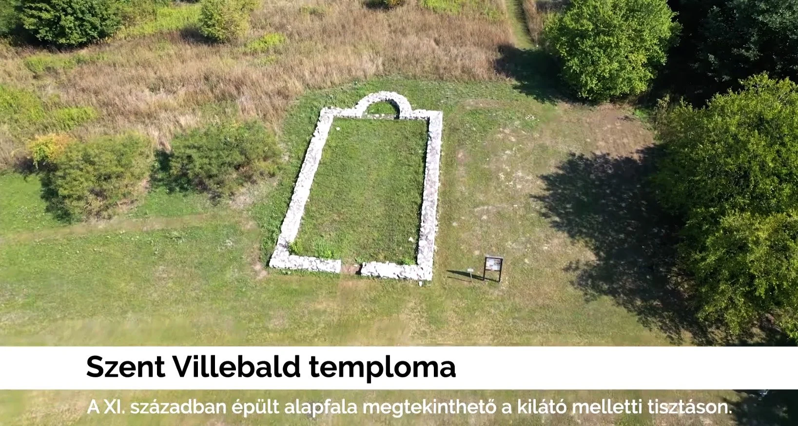
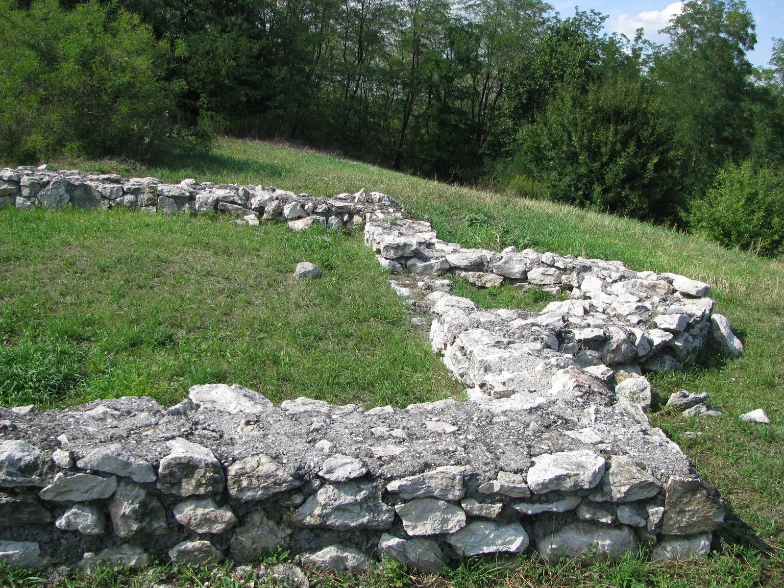
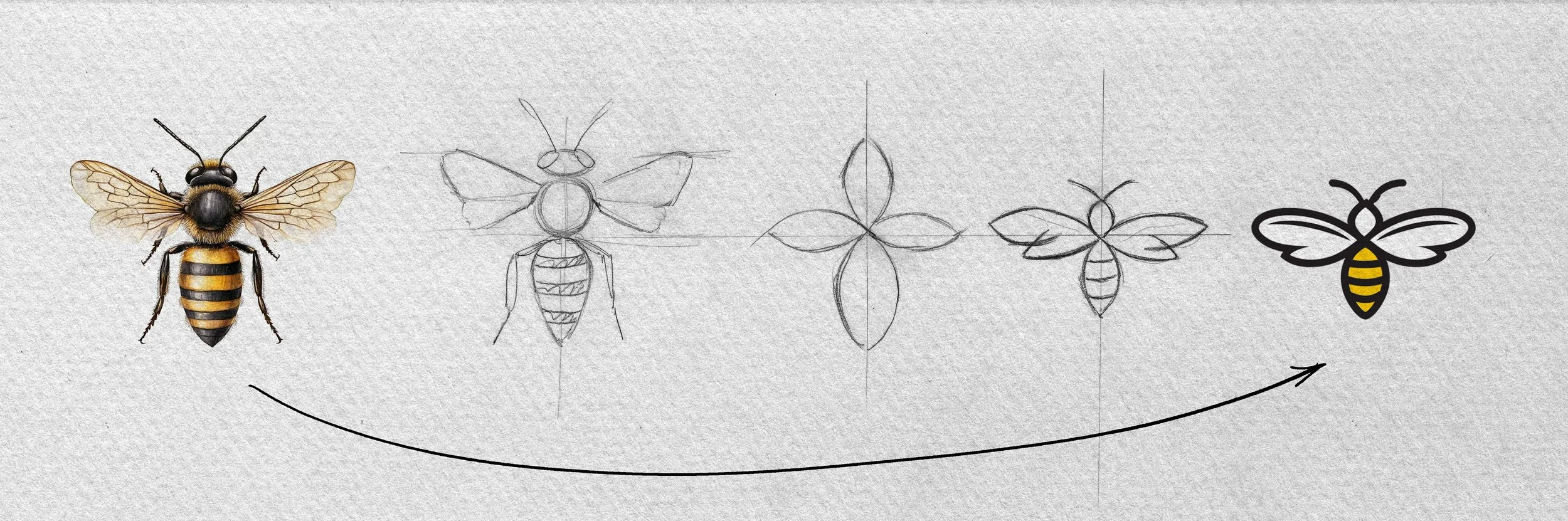
The graphic elements bridge the gap between geography and product origin. The artwork subtly references the historic stone ruins of the late 11th-century church on Villebald Hill, tying the client's forestry location directly to the packaging architecture.
The Solution
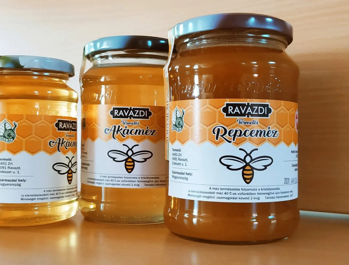
The final label design successfully merges historical storytelling with energetic modern retail aesthetics. By placing the organic, fluid loops of Back to Black against the structured grid of Franklin Gothic, the packaging mirrors the relationship between the wild forestry environment and disciplined beekeeping. The radiant yellow background gives the historical subject matter a fresh, youthful vitality, making it highly attractive on retail shelves.
Results and Impact
Cross-Generational Appeal: The bright color palette successfully captures the attention of younger consumers, while the premium typography and historical roots resonate with older, quality-driven demographics.
Strong Brand Narrative: The packaging functions as a piece of local storytelling, elevating the honey from a simple food product to a meaningful souvenir of the Ravazd Forestry region.
Artisanal/Professional Balance: The product achieves the dual goal of looking like an authentic, small-batch harvest while maintaining the trustworthy presence of an established commercial brand.
Transformed an artisan honey brand into a premium retail-ready product by establishing a comprehensive visual identity and packaging system.
Designed a highly scalable labeling system that allows the client to seamlessly introduce new flavor profiles while maintaining a unified brand presence on-shelf.
Delivered a complete, print-ready asset package including custom illustrations, optimized typography, and material specifications that reduced production trial-and-error.
Case Study no. 1.: Artisan Honey Packaging Design
Honoring 11th-Century Heritage with Modern Visual Contrast
Project Overview
Role: Graphic Designer
Timeline: 2 weeks
Client: Ravazd Forestry Area (Local Honey Producer)
Objective: Design a premium, attractive packaging label for local honey.
Core Requirements: Create a professional yet artisanal feel that appeals to all ages while embedding the village’s late 11th-century history.
The Challenge / The Problem
The client needed to stand out in a competitive market while staying deeply rooted in local identity.
The primary challenge was balancing disparate design goals:
Integrating 900 years of history (the 11th-century church ruins on Villebald Hill) without looking dated or dusty.
Appealing to all age demographics through a vibrant and modern aesthetic.
Maintaining a balance between highly structured professionalism and handmade, organic warmth.